The Color Schemes of the Web’s Best Designed Sites
What does color say about your brand?
Much has been written about the science of colors and the messages that colors convey. Unfortunately for designers, what looks best aesthetically isn’t always what best matches a brand’s goals. Branding is a very nuanced field with lots of nuance. Slogans, logos and sounds all play a big role in triggering brand recall.
But we spent a lot of time thinking about color here at the Altitude Group and especially how colors play out on the web.
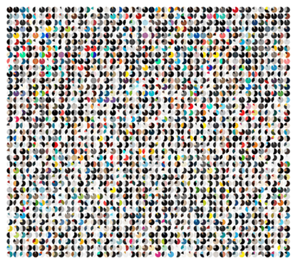
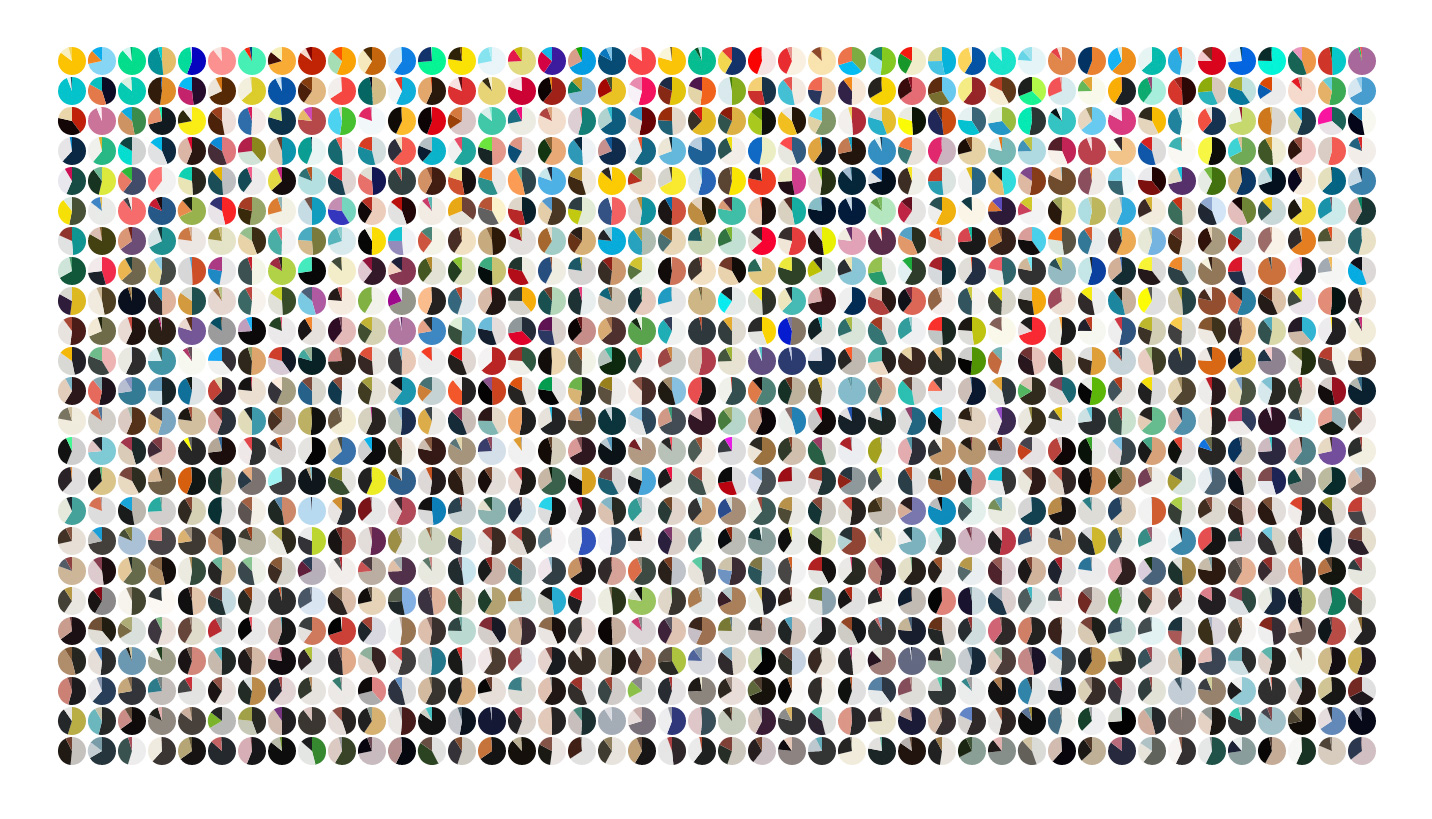
The website Awwwards has been cataloging noteworthy web sites since 2009, serving as a rich source for the history of trends in web design. Matt DesLauriers, a pioneering graphic programmer, developed a program that sorts through the code of an enormous database to provide some truly impressive visuals. The software boils down each site to its three primary colors.
So what color palettes do you most often find on successful sites? According to Awwwards, natural colors are extremely common with lots of pastels and earth tones in the mix.
Websites for Awwwards are judged by “an expert panel formed by some of the most important designers, bloggers, and agencies.”
Above, the color palettes are sorted by luminance, below they’re sorted chronologically.

They’ve also used the tool to find trending color schemes. This month, blue and other cool colors are popular.
Check out the Awwwards website for more, including individual palettes for some of the web’s most beautiful sites. It’s a fascinating take on something that’s too often overlooked: the power of color.

